Setting the Mood

Mood is what brings photography alive. We all use it -- every time you take a snapshot and yell “smile!” you are creating mood.

In professional photography, mood can be almost as important as the subject matter. The rendering of the subject “tells” you but the mood makes you “feel.” Feeling is what creates a brand and ultimately what moves someone toward purchasing your product or service.

Professional photographers must answer a fundamental question: what does my client want this photo to say, and how should the viewer feel after seeing it? For example, a photo can make us excited, sentimental, impressed, motivated, or a host of other emotions that can move them toward your brand and making a purchase.

Let’s look at how certain elements in photography create mood and impact our feelings.

Color and Warmth

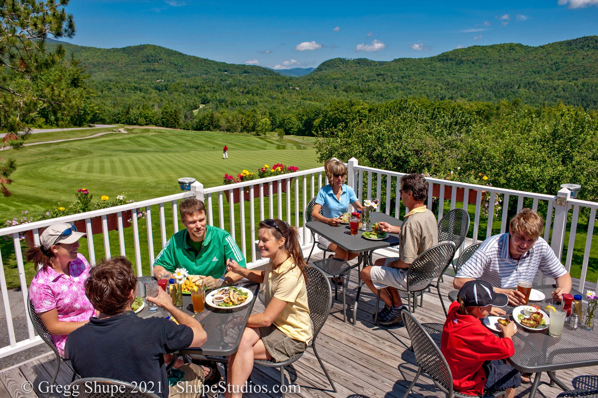
Warm-toned images create a relaxed, inviting feeling. An image like the one shown below evokes positive feeling such as - I’d like to be there, or, that looks like fun. Warm tones set a great mood for businesses such as travel or romance.

A blue-toned image creates a colder, less-inviting impression. It can be used to add an element of foreboding, grittiness, or mystery. This type of tonality tends to make something feel ominous, or in other cases creates a harsher, more edgy look.

Soft vs Bright

We have been trained to associate soft lighting with something that is relaxing, soothing or perhaps somber. Conversely, light and bright evokes energy and positive feelings. The two images below offer a striking contrast - both are floral but you can see that soft brings your blood pressure down and says - relax, whereas sunny and bright lifts you up, and radiates energy.

7445_210508_Gregg_Shupe_iPhone.jpg

Composition

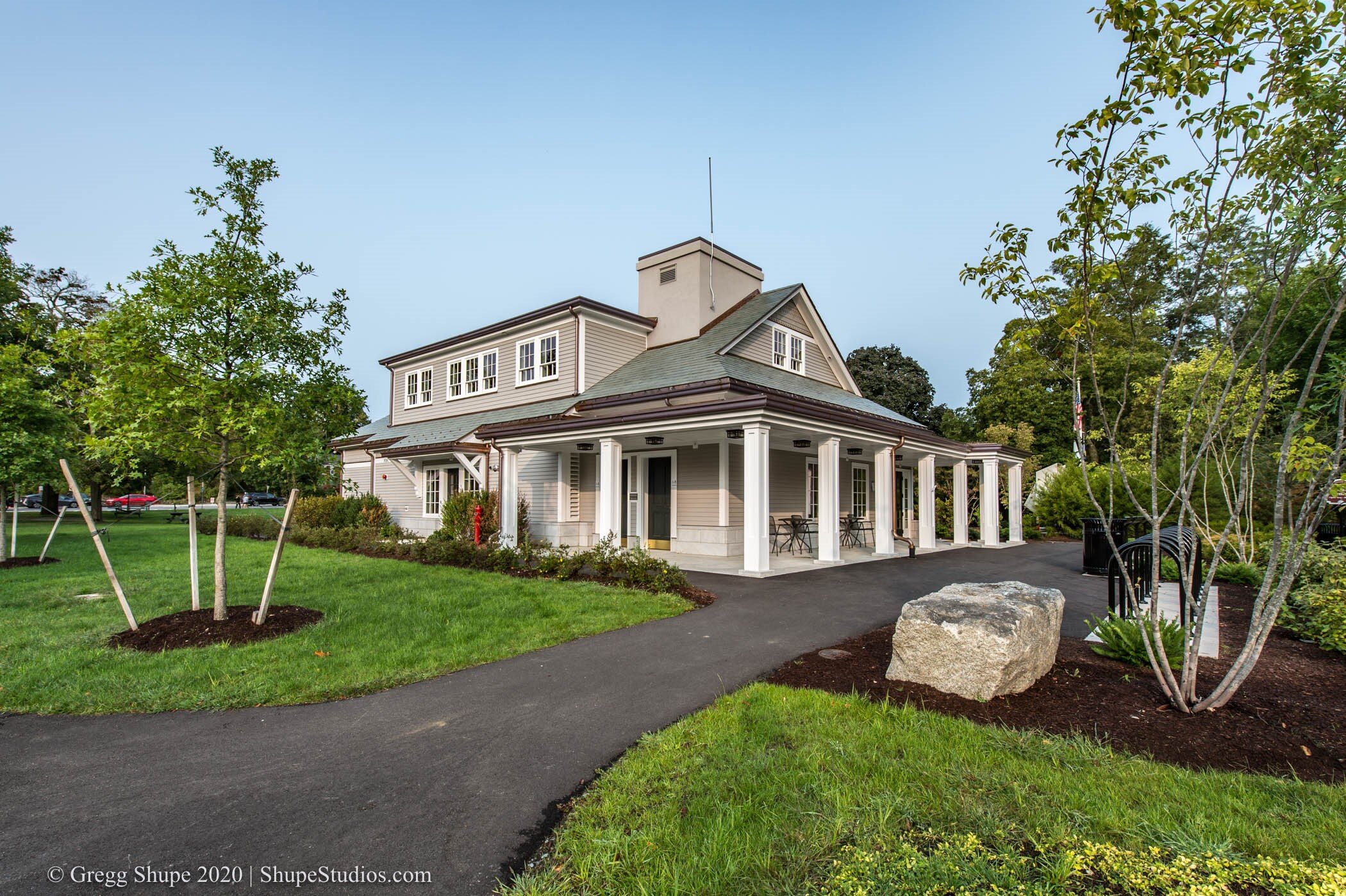
Composition impacts mood through its effect on your eye. Leading lines bring you to a key visual point so your brain and eye don’t have to work as hard. In essence, the image tells you what it wants you to see. It is clean, ordered and visually relaxing. The first shot is an example of excellent architectural photography.

With an un-composed or cluttered image your eyes don’t know where to go. It’s not clear what the image is trying to tell you and this subliminal frustration creates a negative feeling. You tend to move away from this type of image. That is why cluttered, busy advertising tends to be less effective.

Symbolism and Texture

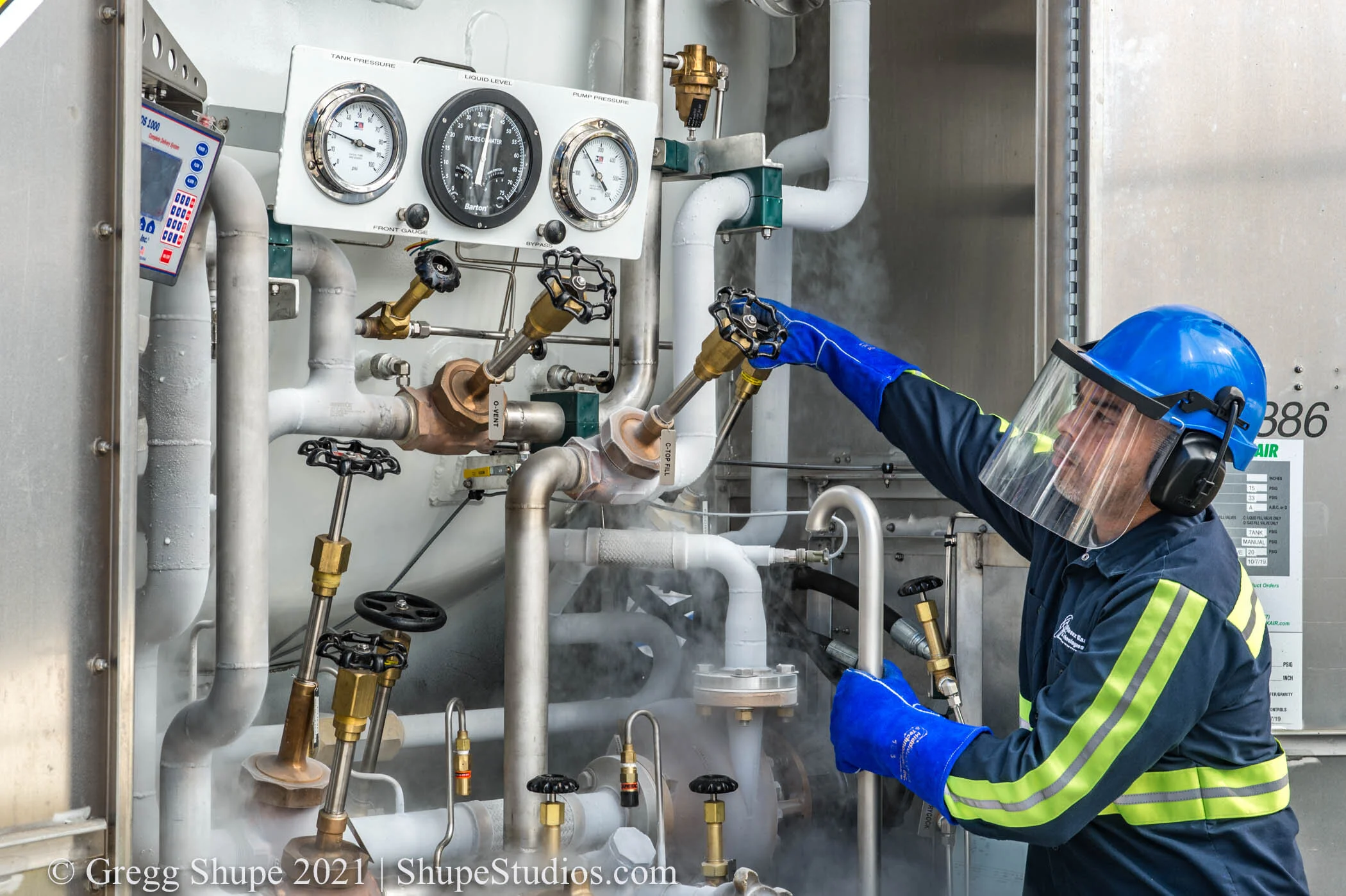
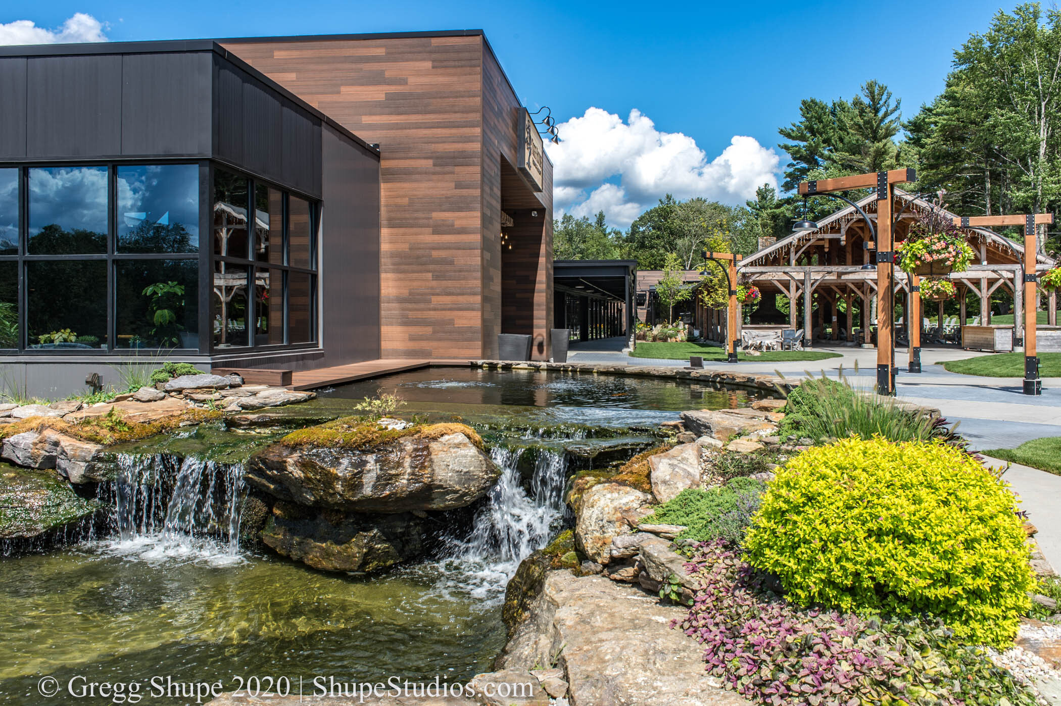
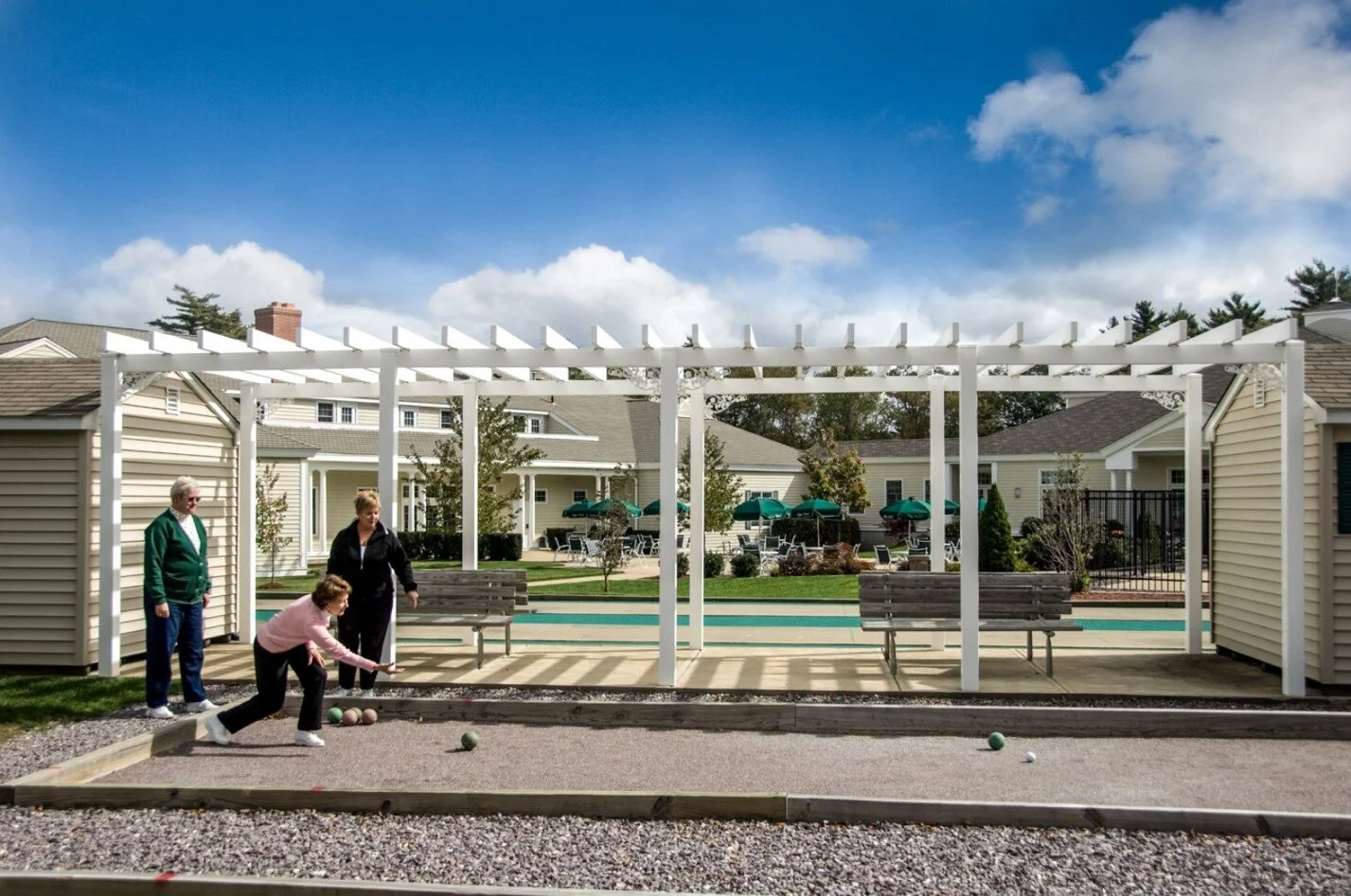
The combination of symbols, texture and lighting make a huge difference in mood. Warm wood vs. cold steel, dark night or blue sky. Take a look at the two photos below - where are you going for a hi-tech seminar and where would you want to kick back and enjoy the company of friends?

Architecture

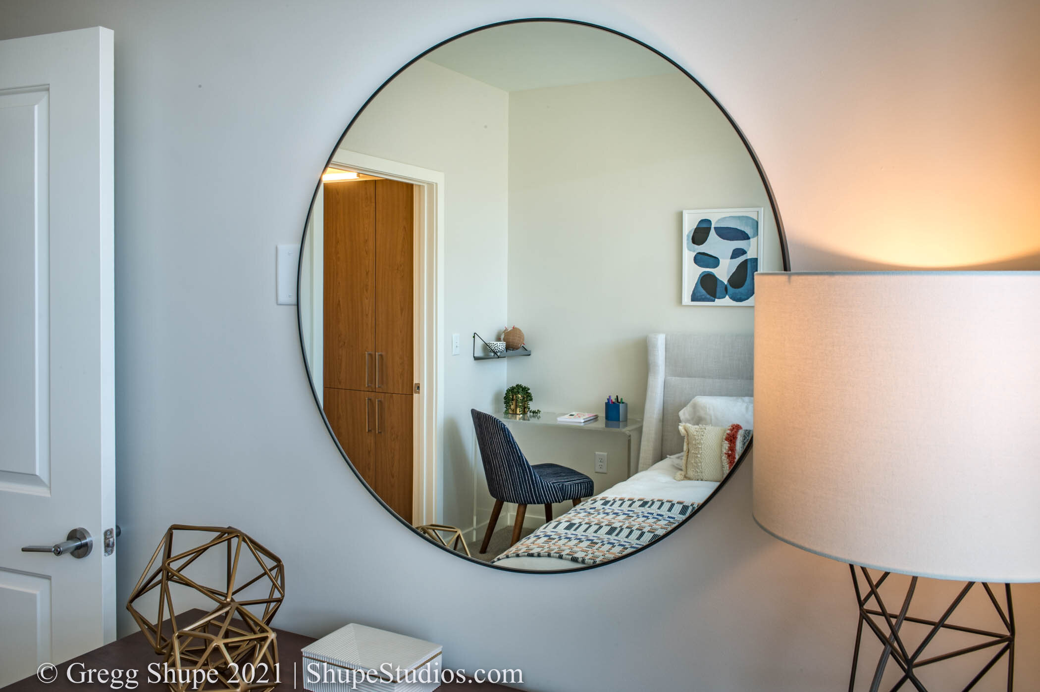
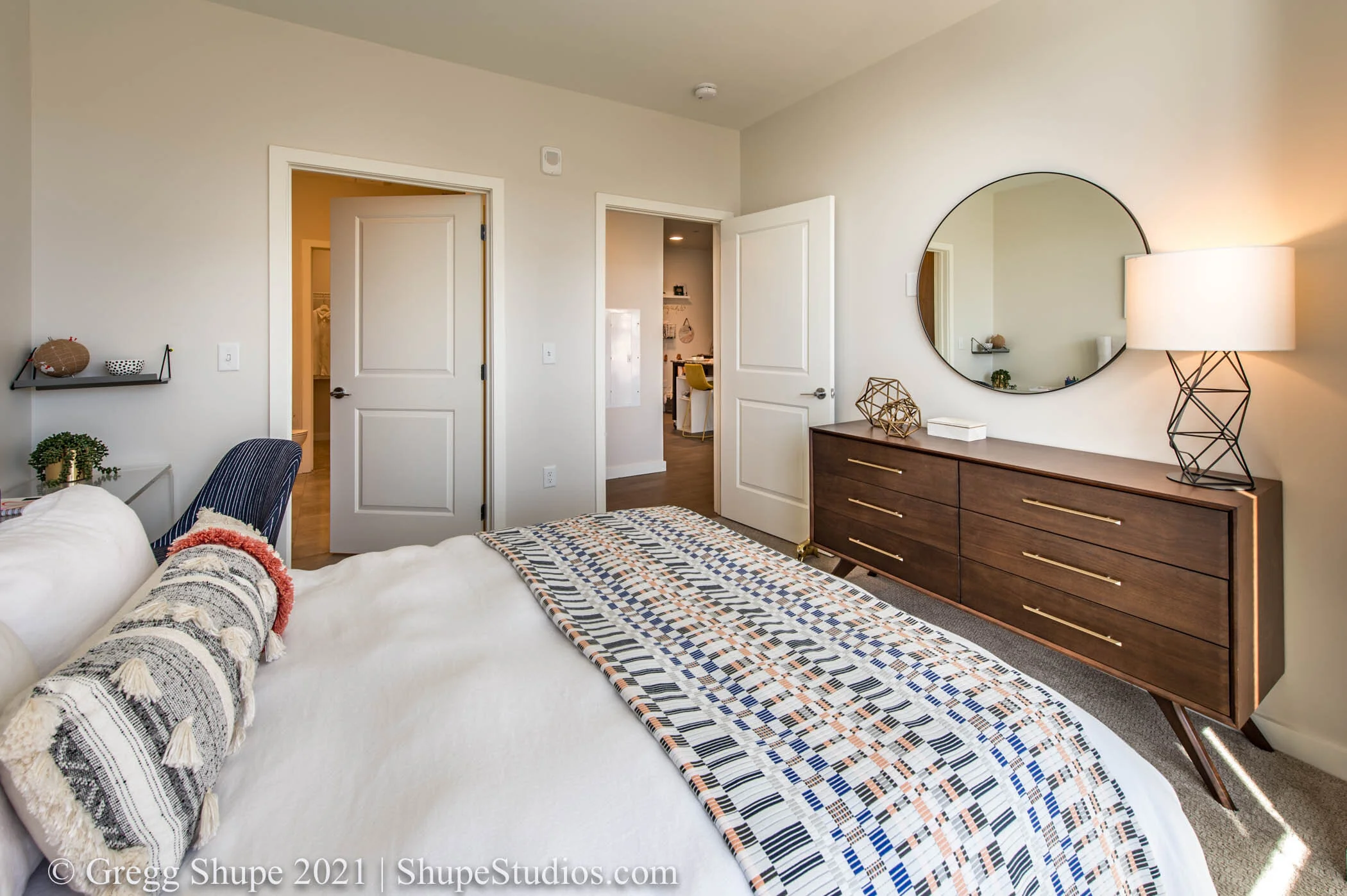
In architecture a normal lens in a tight area can imply a safe, intimate space whereas a wide angle view sets the mood of a large open space and all the feelings that go with it. As you can see below the same space shot with a different lens will have a very different feel.

As a client it, is easy to overlook mood and focus on the subject matter. However, when selling your products and services think of mood as the secret sauce for advertising success.

Work with a photographer to set the visual mood that best fits your brand, bolsters your message and exemplifies your product, project, location or service. Mood is an important piece of equipment in your advertising toolkit, be sure to use it to its fullest.

If you have an important shoot on the horizon I offer two important services at no charge to you:

- A free brainstorming session to identify the right mood to tell your story.

- A free pre-shoot walk-through to stage shots, forestall issues, and identify opportunities to get the perfect shot that says it all.

At Shupe Studios our goal is to wow your audience. If you’re in the Boston area or greater New England, I hope you’ll reach out to me.

We provide one stop shopping for great photography.

A Website Developer Explains How to Take Your Site From Good to Great

We have a guest author this month, Jeff Shaw, Principal of Envision Marketing & Design, Inc., a website development firm located in Metro Boston.

As a website designer I do an extensive amount of work with photography. In fact, in a highly visual medium like mine, it is not an exaggeration to say photography is the key to taking a website from good to great. There are three sources of photography - stock photography, do-it-yourself (DIY), and professional custom photography.

Stock Photography

Buying stock photography has two primary advantages: lower cost and it is instantly obtainable. The major drawbacks are that stock is predictable, readily identifiable as stock, and detracts from the authenticity of a website. Stock photos are generally a bit contrived and will be a force fit into your design. The holy grail of marketing is the unique point of difference you have versus competitors; however, stock photography dilutes that message either overtly or subliminally. Take a look at two examples below.

This stock photo looks sterile. The name has either been photshopped off or the word school photoshopped on. Plus I’m not sure this building is really a school, it may actually be an office building.

This stock photo looks sterile. The name has either been photshopped off or the word school photoshopped on. Plus I’m not sure this building is really a school, it may actually be an office building.

Why is a woman standing above a factory floor looking at her Ipad? This stock photo demonstrates a major downside of stock - it typically looks contrived.

Why is a woman standing above a factory floor looking at her Ipad? This stock photo demonstrates a major downside of stock - it typically looks contrived.

Do-it-Yourself Photography

It can be tempting to use a friend “who has a good camera” or pull out your trusty iPhone. However, it is the person behind the camera, not the camera, that makes for great photography. Not only does a pro produce shots that are head and shoulders above amateur work, but their capabilities in post-production and photoshopping are something an amateur can’t come close to. Below is a DIY photo I was recently given for a website - what kind of impression does it make on you?

This DIY photo does no justice to this facility. The picture is poorly composed, shot on a cloudy day, has no life, is distorted and would detract mightily from an otherwise very professional site. I didn’t use it.

This DIY photo does no justice to this facility. The picture is poorly composed, shot on a cloudy day, has no life, is distorted and would detract mightily from an otherwise very professional site. I didn’t use it.

Custom photography

Hands down, I prefer professional photography when developing a design. It is much higher quality and displays your company, products, or services precisely the way you want them to be seen. It also allows me to storyboard your marketing message and develop a compelling visual narrative for your viewers. It is true that professional photography is more expensive than stock but looking at cost is just one side of the equation. Custom photography tells a more compelling story, provides a stronger message, and builds your brand. That combination drives sales, and in the end, it is not how much you spend but how much you make.

Example of Professional Architectural Photo

Example of Professional Architectural Photo

Example of Professional Photographed Self Perform Employee Photo

Example of Professional Photographed Self Perform Employee Photo

A picture truly is worth a thousand words and makes a significant impact on your target audience. After 20 years in the field here is my advice: Avoid DIY photography like the plague. Stock photos win on price, and if the budget is tight, use them if you have to. However, if you want the most professional website possible, you need custom photos. In my line of work, hands down, custom photography takes a website from good to great.

Strength in Numbers … or Not

A question that frequently comes my way is “do I need to hire different photographers for different types of photography on a large project?” The simple answer is, not necessarily. There is a tier of photographer with the training, experience, and aptitude to be able to handle this type of complex shoot – and do it very well.

Scenario 1

Let’s take the example of resort photography. They need outdoor and indoor photography of buildings, amenities such as golf, hiking trails, shopping, and local points of interest.

104_100615.jpg
327_161007_Gadd_Brook.jpg

Food and entertainment would naturally be included which could include shots of food,

3548_180619_iPhone_Gregg_Shupe.jpg

and of course restaurants, and the resort environment.

126e_180612_Cohasset_Country_Club.jpg

No photoshoot is complete without “people” shots for example, guests enjoying themselves in a spectacular setting.

455e_combined_100615.jpg

The headaches of scheduling multiple photographers, not to mention costs are obvious. A far better option is to have one person do it all.

Scenario 2

A business relocating to a new facility frequently needs multiple types of photography. This could include architectural photography showcasing their new facilities and offices. In addition, it is likely this would be a good time to update product shots in the studio and in the market, staff images, and perhaps ancillary shots for a new website or brochure. Like the first scenario it is far easier hiring and managing just one photographer instead of several. (Easier on the wallet too.)

381_190624_Kirwan_Surgical_Products.jpg
166_191021_Middlesex_Gases_Technologies.jpg
767_191104_Middlesex_Gases_Technologies.jpg

Seeing it in Action

The photos below have a common link – they were all shot by yours truly doing exactly what I’ve described - ranging from aerial to people.

Aerial

Aerial

Food

Food

Architectural interiors

Architectural interiors

Products

Products

Architectural exteriors

Architectural exteriors

People

People

While I love my specialty of Architectural Photography I’m frequently called upon to handle complex projects with multiple needs. It saves my clients time, hassles and costs – as well as providing a better end product since the project is undertaken in a holistic manner versus many people contributing pieces.

If you have a complex shoot on the horizon I offer two important services at no charge to you:

·         A free brainstorming session to identify and formulate great images that tell your story.

·         A free preshoot walk-through to stage shots, identify opportunities and very importantly to forestall issues. (You would be surprised at how many disasters have been preempted by a thorough project walk through.)

This process allows me to understand your objectives, make suggestions, plan out the shoot and then provide photography that wows your audience. If you’re in the Boston area or greater New England, I hope you’ll reach out to me at Shupe Studios.

We provide one stop shopping for great photography.

The Art of Photographing Small Spaces and Tight Interiors

As an architectural photographer one of the toughest challenges I face is shooting tight interiors. Inside you’re dealing with physical space constraints, different light temperatures, uneven room lighting, room angles, and the challenge of capturing a space from just one vantage point.

Lens

The choice of lens is critical to success, too narrow and you lose the room’s personality, too wide and you get distortion. My go-to architectural lens is the widest without producing distortion in a given setting. I like to think of it as a grand view.  Plus shooting as wide as possible allows a good graphic designer to crop in and adjust the shot. Alternatively, using a longer lens, and cropping in is a great technique to showcase a key architectural element. Using this same technique in a very large space provides another option by telegraphing to the viewer that it is a sizeable room.

Lighting

More often than not I need to supplement or adjust the ambient light in a room to fill shadows, even out the light, or create focal points.  To the extent possible I try to balance lighting sources so I don’t have conflicting color temperatures throughout a room, or if I do, I control them to enhance and add drama to the shot. Color temperature is measured in Kelvin (K), with three common ranges: Warm Light (2700K-3000K); Cool White (3000K-5000K), and Daylight (5000K-6500K).

Windows

Windows are an important architectural element in any room with exterior walls. However, properly lighting the room often means that windows are completely blown out – especially if you are shooting directly toward them. In this case I’ll take multiple shots, one with the correct settings for the room, one for the windows, then merge them in Photoshop for a perfect photo. 

 Mix far/ near/ close-up /and detail shots in your photography

  • Many people make the mistake of taking all their photos from the same distance

  • For a given property it is best to photograph it the way people will experience it – from afar, in intimate detail, and anywhere in between

  • The effect of mixing shots significantly enhances a portfolio or spread

Experience the Room the Way a Person Does

In the following three shots notice how I am photographing the room as someone would experience it. First as you would see it in its entirety when walking in, then from a mid-distance having entered the room, and lastly in a more intimate setting in front of the fire and TV.

In the first two pictures below notice the bluer light coming from the windows and the warmer light on the interior of the room. Lastly notice the drama the lens provides to the far and mid-distance shots. There is clearly a distortion but here it adds a nice effect, in particular interesting angles on the ceiling.

shupe 1.jpg
shupe1a.jpg
shupe1c.jpg

Detail Shots

Detail shots provide a nice complement within a series of images. Notice the simplicity of these shots - just enough staging but not too much. Also take notice of lighting. The lower K temperatures in the first image creates a warmer calming mood while the bluer higher K temperature in the second creates energy and a more contemporary vibe.

shupe 2.jpg
shupe4.jpg

Interplay of Light

Here various lighting sources enhance the architectural elements of this unique wall feature. Warmer artificial light from above meets the daylight cast from windows below to create an interesting color gradient. The various lighting sources make for an interesting array of shadows and add depth.

shupe5.jpg

Composing the Vantage Point

Taken from another vantage point this shot might be unremarkable. However by contrasting shapes, colors and angle we create an interesting picture that teases the viewer a bit. Are we focusing on the bike, the green tubes, the white pipes or everything? The lens creates interesting angles within the ceiling, adding drama.

shupe6.jpg

Far / Medium / Close

 These shots accentuate the size of the room and also demonstrates different vantage points going far to near. The lens accentuates the foreground in the first adding stature and gravitas to the room. We also have the vantage point of two rooms. As we move closer things change and the setting becomes increasingly more intimate.

shupe7.jpg
shupe8.jpg
shupe9.jpg


Grand View with a Foreground Subject to Start the Story

This shot is simply a lot of fun. The ceiling with its myriad of shapes and angles make a somewhat dull room very interesting. The Kuka in the foreground engages the viewer -- what is it exactly and why is it there? A little staging and a keen eye take a room from good to great

shupe10.jpg

If you are an architect, builder, developer, or business owner wanting to showcase your space our expertise with interior architectural photography takes buildings from good to great. I’ll hold a walk-through with you to understand your objectives, make suggestions, plan out the shoot and then provide photography that wows your audience. Every building has a story – let us help tell yours.

Think I can wow you? If you’re in the Boston area or greater New England, I hope you’ll reach out to me at Shupe Studios.

Why Museums Need Architectural Photography

Why Museums Need Architectural Photography

In many ways, the exteriors and interiors of museums are the unsung heroes. While people are drawn to exhibits and artwork that museums showcase, the amount of time and detail put into the museums themselves, from enhancing the experience from how it’s presented on display and in the room, to the historical and cultural significance of the museum itself, this is something to be proud of and show off. This is where architectural photography comes in.

Read More

Photoshop Technology Just Got a Lot Better

I make it a point to keep up with the latest technology and incorporate it into my workflow. It makes a world of difference in the quality of the end product I provide to my clients and the results they achieve in their marketing efforts.

As a case in point, although I can’t control the weather on shooting days (yet) technology allows me to do the next best thing.

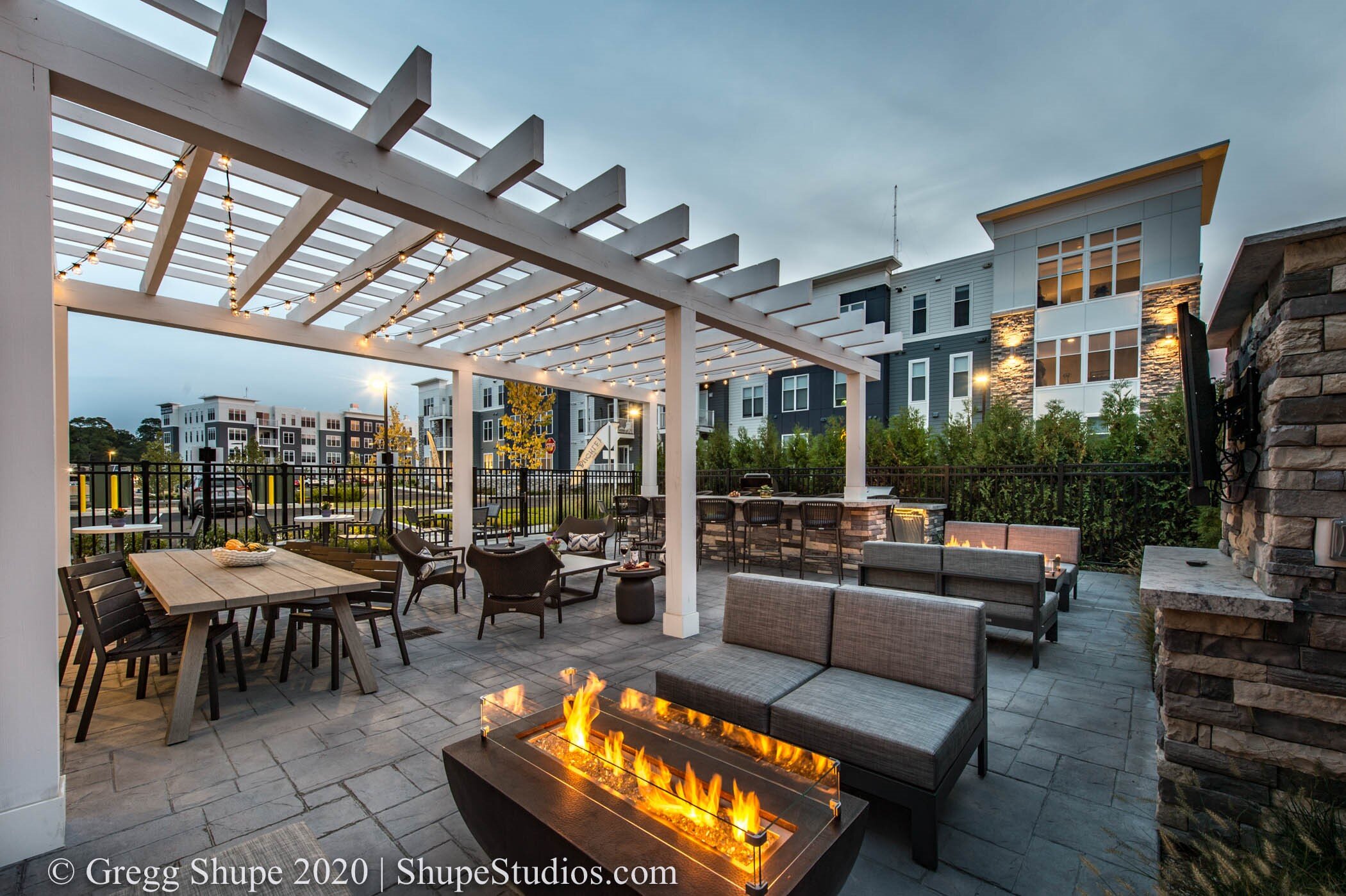
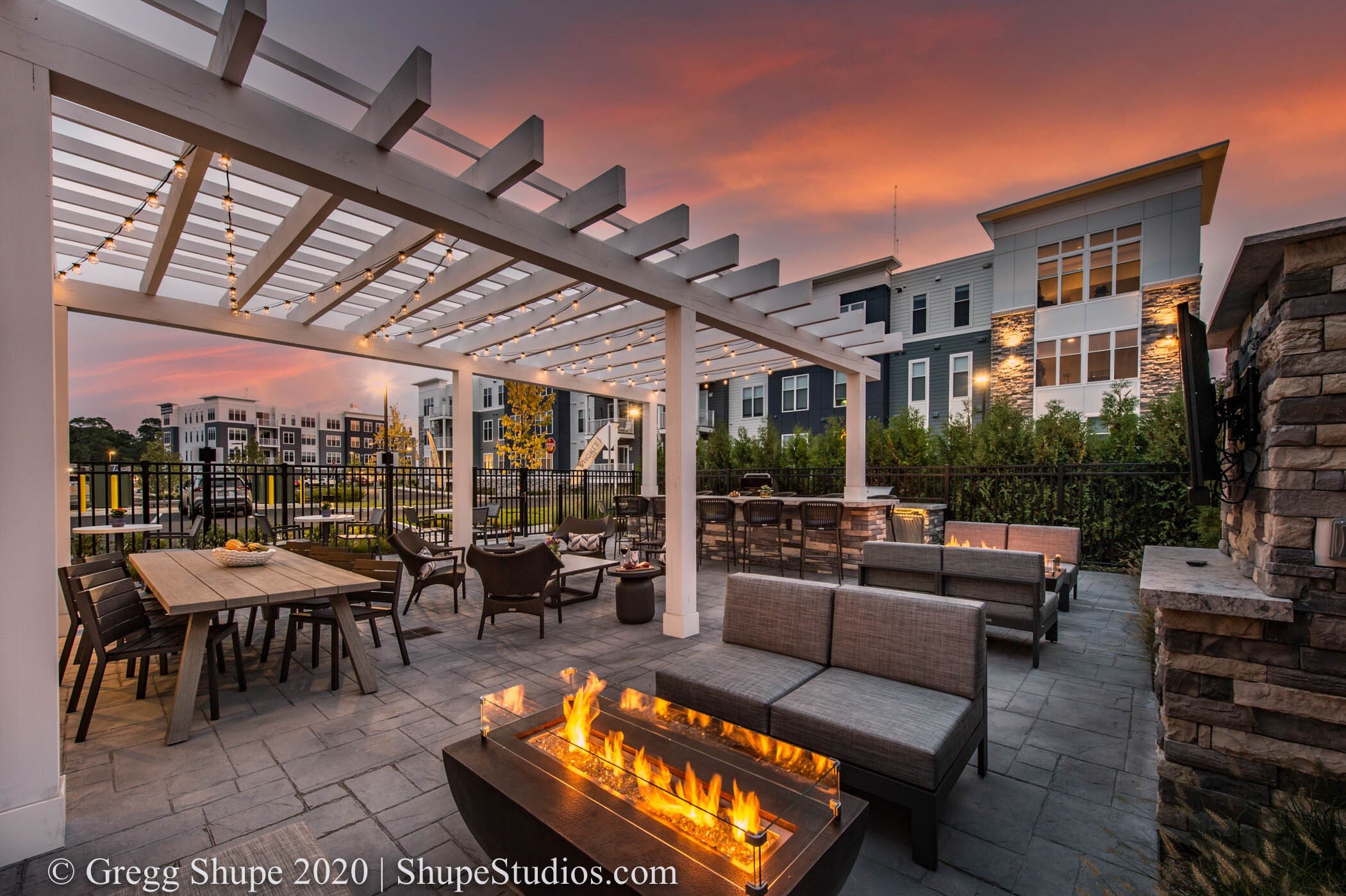
A while back I had a shoot scheduled for an apartment complex patio at twilight. The day was clear and beautiful until an hour before the shoot. As we prepared, including a lot of lifestyle staging, the sky became overcast and dull. I was able to edit the shot in Adobe Photoshop and after a lot of work provided the picture on the right to my client, a big improvement.

shupe studios photo editing

However, that was before the latest updates from Adobe Photoshop. With advanced technology I get a superior result in less than half the time.  Take a look at that original photoshoot and what I was able to do in minutes with new technology.

Before

Shupe Studios before image


After

Shupe Studios with Photoshop Editing

  Here is another example

Shupe Studios - Photoshopping in a new sky

If you notice not only did I change the sky, I automatically filled holes in the trees, plus adjusted the overall color and feel of the building to match the new warm tones of the sunset. With my library of skies I can find the perfect option for any situation plus I can do it quickly and efficiently. A better photo at less cost is music to my client’s ears and great for me too because I deliver a better end product.

 Good to Great

Below are two other projects from this month. In the first case my client wanted to showcase their newly designed roundabout. We had the picture but my client wanted to show its use by multiple residents, both large and small, on multiple types of vehicles. Presto - more people on bicycles, and a pickup with a trailer. It would have taken hours to get those included during the shoot but we did it in minutes in our studio. You will also notice other enhancements – a brighter day, a nicer sky, better foliage, new grass, and colors that pop.

Shupe Studios - photo enhancement

In the shot below we see a similar situation but indoors. As above, we took a shot from good to great. They wanted the TV turned on and lots of little distracting items removed like emergency lights, fire alarms, and ceiling fixtures…plus we added a little pop to the color.

Shupe Studios - Indoor photography

It used to be that we took what mother nature gave us or an interior shot simply was what it was. Sometimes it was great and other times not. However, using the latest technology we are able to modify and perfect pictures to levels unimaginable a few years ago – both quickly and effectively. Advancing technology has enabled us to provide a better product in less time, with less cost.

If you are a Builder, Architect, Developer or Property Manager and need the best, we are here to help. Let us take your properties from good to great. Whether outdoors or inside we have the tools to create spectacular pictures on unspectacular days.

Want to learn more about Photoshop?

At its Adobe Max conference Adobe announced many new features across their platform. One of the most exciting is the ability to replace a sky as I’ve demonstrated above. For those of you who work in Photoshop and want to learn more, take a look at the following tutorial by Adobe Evangelist Terry White. The section about creating new skies begins at 4:36 – you will enjoy it: https://www.youtube.com/watch?v=5B_SErwk_JY

Rule Number 1 in Architectural Photography – Light it Right

One of the most important aspects of photography is lighting. It is true both indoors and outdoors but has particular application for architectural photography. When shooting a building most property managers assume the photographer will come out on a nice day, set up, take pictures and that is the end of it. Not quite. A commonly overlooked fact is that during the course of a day light shifts around a building and therefore to do it right so must the photographer.

Some shoot all sides of a building at the same time but there is a big downside. Photographing all sides at once means one side may look great but the rest can be sub-par. Take an east/west facing building – a morning shot of the front will be bathed in light but leaves the back in shadows. Retouching and Photoshopping can help but the presence of distinct shadows will limit the degree of effectiveness. The bottom line is that shots taken at the right time will look the most authentic and be the most visually impactful. The only effective solution is for the photographer to shoot a building at different times of the day to capture optimal sunlight on each side.

Case Study

Let’s take a look at a recent shoot – the new Lexington Visitors Center. I photographed the building at three different times to capture the best light for my client.

Morning – Back

The first series of shots were taken early morning to capture this side of the building in full sunlight.

gregg shupe architectural photography - lexington visitors center.jpg
Shupe architectural photography - lexington visitors center.jpg

Afternoon – front

I returned in the afternoon to capture the west facing front of the building in full sunlight (during the morning shoot this side of the building was dark and in shadow)

lexington visitors center front - shupe photography.jpg
lexington visitors center.jpg

Evening – Magic Hour

I then returned a third time, in the evening, just after sunset to capture an additional lighting scenario – the time of day photographers refer to as “magic hour” where you have the perfect mix of ambient and artificial light.

lexington visitors center magic hour shupe photography.jpg

Interiors

Yes, time of day definitely matters with interior shots. A staged interior is best shot with photographer lighting to draw your eye toward the staging and room architecture.  Conversely an empty or sparsely furnished room can benefit from strong sunlight to create “window graphics” on the empty floor. You can see an example below in the Visitors Center. The light pattern on the floor clearly adds interest and helps to fill the room. I had to be there at exactly the right time to capture the incoming light and place the window graphic where I wanted it on the floor. Think about that same picture without the window graphic – it would look flat and empty.

lexington visitors center interior shupe photography.jpg

 Surrounding Structures

We don’t tend to think about surrounding structures or trees until we set out to photograph a building  then realize they are stealing its light. We need to factor not only the sun’s position in the sky but also where and when shadows fall onto our subject building. Not too long ago I was asked to photograph Old City Hall in Boston. A commanding structure when it was built it is now dwarfed by much taller office buildings making the shot difficult as it falls in their shadows. In this case pre-shoot planning was critical as I had to observe the interplay of light and shadows throughout the day before I could determine an optimal time for the shoot.

old city hall shupe photograohy.jpg

 In some urban environments or situations such as time of year you need go to plan B – recognizing a daylight shot may not be your best option. In that case a twilight “magic hour” solution may be the best option. This can also be a good solution when, in the case of office buildings for example, you want them looking occupied. Later in the fall and particularly with the arrival of daylight savings time buildings are fully occupied at twilight (with current COVID exceptions) and all the lights are on. This can make for a great photo.

Light it Right

Shooting each aspect of a building in the correct light is imperative for quality architectural photography. That may mean coming back to the shoot different times throughout the day – or even on different days because of Mother Nature’s fickleness.

Preplanning is a critical element – it is important to scout the location for time of day, presence of surrounding structures and planning for contingencies. Also consider time of year and leave time in your due dates for potential weather delays.

When you are considering architectural photography make sure you remember that as light shifts around a building so must the photographer. (At Shupe Studios we gang our hours to enable this benefit in every project we undertake.)

Impressive pictures of your property are integral to successful marketing. Attention to detail, planning, and proper lighting pay big dividends. A myriad of things go into successful photography but when you think about architectural photography don’t forget rule number one - light it right.

Don’t Wait Until Spring – the Advantages of Fall Photography

Fall is a terrific time of year to shoot landscapes and building exteriors. Plants have recovered from the intense summer heat and landscapes are at their best. Building construction tends to finish in the fall so you will be shooting completed projects while everything is new and fresh, with easy access to the premises. Importantly this year’s projects can be photographed and utilized for marketing purposes during winter and spring.

Clipper Ship East Boston

Green Landscape

Victor By Windsor Gardens

Once September arrives plants have had a full growing season behind them and have recovered from summer dryness. Lawns are greener, plants look healthier and the landscape is more lush. If your intent is to make the best impression these are important considerations.

The Business Cycle

Meriel Marina Bay Quincy

Often, project exteriors are completed in the fall while interiors will be finished over the winter. Taking fall shots of a building exterior allows you to make it appear farther along than maybe it is and provides the opportunity to merchandise a project in advance. A good example is apartment buildings or condo complexes where you will be pre-selling prior to project completion. Photos go a long way toward helping people visualize your project, making for an easier sell. By combining shots of a building with the surrounding area we can create an excellent presentation even if things are still under construction.

Dramatic Light

Patio Dinning with Great Landscaping

Less moisture in the air means cleaner crisper shots and more vibrant color. Lighting is also a consideration. During summer the sun is higher in the sky and more intense. There are fewer shadows and less contrast so midday photography can be a little harsh on landscapes and buildings. The addition of shadows, contrast and dappled light adds great dimension to your photos. For those needing twilight shots of buildings (magic hour) the shorter days of fall generally prove advantageous.

Fall Foliage – or Not

Tree House Brewery

Landscape photography in the fall doesn’t necessarily mean that it has to include fall foliage. The great thing about fall is that you can get the best of both worlds – a nice summer feel or a colorful fall foliage scene. Your subject matter and the purpose of the photo will be the guiding factor. For example, a college campus with fall foliage says back to school and makes a lot of sense to the target audience. Conversely you may want a residential shot to convey the entirety of the outdoor season so a summertime feel is most appropriate.  Fall photography affords both.

Don’t Wait Until Spring

It’s often tempting to wait until spring but there are downsides:

· Late spring photography means you can’t show off what you did last year. That is particularly important when considering the winter / spring selling period in your marketing and project bidding.

· Early spring photography can be difficult for landscapes as plants need to leaf out and lawns must recover from snow cover damage before shooting.

· Wet spring weather can create scheduling problems for outdoor photography combined with the fact that it is frequently difficult to get back on-site months after completion.

If you have completed or nearly completed projects give shooting this fall strong consideration. Your marketing collateral, website and sales materials will show a property at its best. The landscape will be pristine and fresh just the way you want it and importantly you will be ahead of the curve – showing your most recent projects now vs. later.

Here at ShupeStudios we’re experts in architectural photography, both residential and commercial. We have years of experience shooting building interiors and exteriors – including landscapes. Want to get a head start on next year – give me a call and let’s discuss fall photography.

Making Assisted Living Units Photography Look Grand

Making Assisted Living Units Photography Look Grand

As the generation of Baby Boomers continues to get more gray hairs, we’re seeing non-stop construction of more Assisted Living Units and Continuing Care Retirement Communities (CCRC). For many, this transition from independent house and family living can be a daunting change. It’s up to you to make sure your photos capture the quality of your units and common spaces, as well as all the community and fun that is available to residents. I’ll break down a few of the most common ways I capture it.

Read More

Where Do Vertical Images Fit into Architectural Photography?

Where Do Vertical Images Fit into Architectural Photography?

Professional photography in general – but also architectural photography specifically – makes use primarily of horizontal images. The term “landscape” to denote orientation is very telling – not only for shooting scenic vistas but also to provide a more grounded look for architectural photography of the exteriors and interiors of buildings. Today I’m going to look at the place vertical images have in architectural photography and why you should make sure your photographer is taking some.

Read More

Sustainability in Business, Photography, and the Coronavirus

Sustainability in Business, Photography, and the Coronavirus

It’s a strange time for any individual, let alone a business owner and operator. However, during this time of stay-at-home orders, remote work, and social distancing, it’s important to take pride in the small victories we can all have. For years I have been an avid believer in sustainability, and I’m finding many of my practices and technology I’ve adopted over the years is helping myself, my clients, and, as important, the environment right now during COVID-19.

Read More

Doorways and Leading Lines: Creating Welcoming Photography

Doorways and Leading Lines: Creating Welcoming Photography

While I service clients with all sorts of backgrounds and needs, the vast majority in part or in whole are looking to sell an experience. For the hospitality industry, this means selling individual rooms and activities. For property owners, this means selling a building and its location. For architecture and construction agencies, this means selling the expertise of architecture. With first impressions being vital, I often take special time to focus on entrances for their outsized effects on viewers, making them great tools for all my clients.

Read More

ShupeStudios Now Offering Virtual Tours Through Matterport

ShupeStudios Now Offering Virtual Tours Through Matterport

In the COVID-19 time of social distancing, we all still need to work on, show off, and sell apartments, offices, and real estate. We still want viewers to be able to see and learn about the inner spaces without violating Stay-at-Home orders or putting people at risk. From showing off completed projects and providing insights on the completed property to a showcase for a company’s portfolio and future bids, I am proud to announce I am now offering Virtual Tours through Matterport. This is a great tool that is almost science fiction with a new way to share the architectural experience.

Read More

Architectural Photography: Shooting Unfurnished Rooms

Architectural Photography: Shooting Unfurnished Rooms

A common issue with new constructions or leasing properties for apartments, condos, and houses is getting great photography when the rooms are empty. Often it doesn’t make sense for the property managers or real estate agents to spend the time and money to stock single rooms or full units or houses. But on the other hand, many fear a lack of interest for potential buyers and renters if they just see empty rooms. In this post, I’ll go over some of the techniques and tips I use when shooting unfurnished rooms.

Read More

Coronavirus Solution: ShupeStudios is Open and Offering Real-time Video Proofing

Coronavirus Solution: ShupeStudios is Open and Offering Real-time Video Proofing

ShupeStudios is looking to be as diligent and responsive as possible while keeping work flowing in the turbulent time pertaining to the Coronavirus (COVID-19). I’m currently keeping all currently scheduled sessions and are accepting new clients. Thankfully our industry is one where we can take measures to still perform all duties, especially with the use of technology so clients can stay home and still be involved in the process.

Read More

Architectural Photography: Daytime vs. Nighttime Shots

Architectural Photography: Daytime vs. Nighttime Shots

One of the biggest assets and liabilities for a professional architectural photographer is lighting. It’s important you know the thought process behind photographers picking days and times and what can start or halt a shoot. Today we’re going to talk about two very different types of photoshoots: daytime and nighttime shots and what it takes as a photographer and client to make them happen.

Read More

Architectural Photography: A History of Cultural Significance

Architectural Photography: A History of Cultural Significance

A break from my normal blogs, in this post, I want to provide a little historical context for architectural photography, including how it has grown with photography as a whole. It’s important to understand how architectural photography captures the history and culture of buildings, skylines, and whole cities, and how that should factor into your own search for the perfect architectural photography.

Read More

Chasing That Perfect Snow Photography for Your Resort

Chasing That Perfect Snow Photography for Your Resort

The dead of winter is a bad time for most businesses, but not for your resort. Skiing, snowboarding, and other winter sports are your lifeblood. While you’ve got a core of consistent clients, you’re also looking to get new customers – and for that, you’ll need new photography. In this blog, we’ll look at the obstacles you’ll need to overcome, as well as tips and tricks to get the best snow photography that’s possible.

Read More

How Light Expresses Emotion in Architectural Photography

How Light Expresses Emotion in Architectural Photography

While it’s not something you probably think about when you’re at the office or at home, the lighting that surrounds you has a subtle impact on your mood and appreciation. These feelings translate over to professional photography, which already has a strong relationship with lighting. Below, I’m going to talk about how important it is to be aware of the lighting inside and outside of buildings and how changes may need to be made (pre or post-processing) to get the best architectural photography of your business.

Read More

What Must Be Changed Before Building Photography Starts

What Must Be Changed Before Building Photography Starts

Just as you would pay special attention to your grooming and attire in the days leading up to a new headshot or important photo, the same care needs to be taken with the architectural photography of your building, inside and out. The difference is one of scale, with a building needing the attention of you, your staff, and the architectural photographer. Learn how to get the perfect photo session.

Read More