As an architectural photographer one of the toughest challenges I face is shooting tight interiors. Inside you’re dealing with physical space constraints, different light temperatures, uneven room lighting, room angles, and the challenge of capturing a space from just one vantage point.
Lens
The choice of lens is critical to success, too narrow and you lose the room’s personality, too wide and you get distortion. My go-to architectural lens is the widest without producing distortion in a given setting. I like to think of it as a grand view. Plus shooting as wide as possible allows a good graphic designer to crop in and adjust the shot. Alternatively, using a longer lens, and cropping in is a great technique to showcase a key architectural element. Using this same technique in a very large space provides another option by telegraphing to the viewer that it is a sizeable room.
Lighting
More often than not I need to supplement or adjust the ambient light in a room to fill shadows, even out the light, or create focal points. To the extent possible I try to balance lighting sources so I don’t have conflicting color temperatures throughout a room, or if I do, I control them to enhance and add drama to the shot. Color temperature is measured in Kelvin (K), with three common ranges: Warm Light (2700K-3000K); Cool White (3000K-5000K), and Daylight (5000K-6500K).
Windows
Windows are an important architectural element in any room with exterior walls. However, properly lighting the room often means that windows are completely blown out – especially if you are shooting directly toward them. In this case I’ll take multiple shots, one with the correct settings for the room, one for the windows, then merge them in Photoshop for a perfect photo.
Mix far/ near/ close-up /and detail shots in your photography
Many people make the mistake of taking all their photos from the same distance
For a given property it is best to photograph it the way people will experience it – from afar, in intimate detail, and anywhere in between
The effect of mixing shots significantly enhances a portfolio or spread
Experience the Room the Way a Person Does
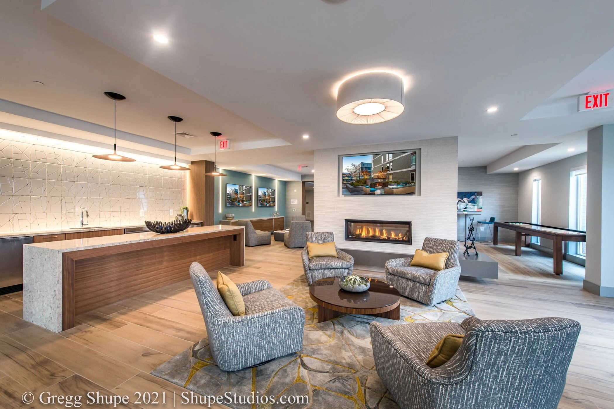
In the following three shots notice how I am photographing the room as someone would experience it. First as you would see it in its entirety when walking in, then from a mid-distance having entered the room, and lastly in a more intimate setting in front of the fire and TV.
In the first two pictures below notice the bluer light coming from the windows and the warmer light on the interior of the room. Lastly notice the drama the lens provides to the far and mid-distance shots. There is clearly a distortion but here it adds a nice effect, in particular interesting angles on the ceiling.
Detail Shots
Detail shots provide a nice complement within a series of images. Notice the simplicity of these shots - just enough staging but not too much. Also take notice of lighting. The lower K temperatures in the first image creates a warmer calming mood while the bluer higher K temperature in the second creates energy and a more contemporary vibe.
Interplay of Light
Here various lighting sources enhance the architectural elements of this unique wall feature. Warmer artificial light from above meets the daylight cast from windows below to create an interesting color gradient. The various lighting sources make for an interesting array of shadows and add depth.
Composing the Vantage Point
Taken from another vantage point this shot might be unremarkable. However by contrasting shapes, colors and angle we create an interesting picture that teases the viewer a bit. Are we focusing on the bike, the green tubes, the white pipes or everything? The lens creates interesting angles within the ceiling, adding drama.
Far / Medium / Close
These shots accentuate the size of the room and also demonstrates different vantage points going far to near. The lens accentuates the foreground in the first adding stature and gravitas to the room. We also have the vantage point of two rooms. As we move closer things change and the setting becomes increasingly more intimate.
Grand View with a Foreground Subject to Start the Story
This shot is simply a lot of fun. The ceiling with its myriad of shapes and angles make a somewhat dull room very interesting. The Kuka in the foreground engages the viewer -- what is it exactly and why is it there? A little staging and a keen eye take a room from good to great
If you are an architect, builder, developer, or business owner wanting to showcase your space our expertise with interior architectural photography takes buildings from good to great. I’ll hold a walk-through with you to understand your objectives, make suggestions, plan out the shoot and then provide photography that wows your audience. Every building has a story – let us help tell yours.
Think I can wow you? If you’re in the Boston area or greater New England, I hope you’ll reach out to me at Shupe Studios.


