We’ve had several Adobe Photoshop and Lightroom tutorials in the past, such as making snow pop, dehazing your photos, and using metadata. Time to add another trick or two to your toolbox, perfect for seasonal and year-round Photoshop work. Also, make sure to check out Last Year’s Card-Making blog for more ideas!
The Making of This Year’s Holiday Card
I thought I would enlighten you on how this year holiday card came to be. First, I needed a theme. So I spent many hours going through image search engines looking for creative ideas to draw from. Sort of the way a cook will go through lots of cookbooks to come up with their own take on a beginning item they started with. I have chicken breasts…what am I going to do with them?
Picking a Theme
Drawing from my research and partly the state of the News world, I decide what we all need is the best gift: Peace on Earth. Continuing to think the image through I thought who else to receive the this best gift for all of the people of earth but Santa. And best to give it to him but lots of children.
Setting Up the First Shot
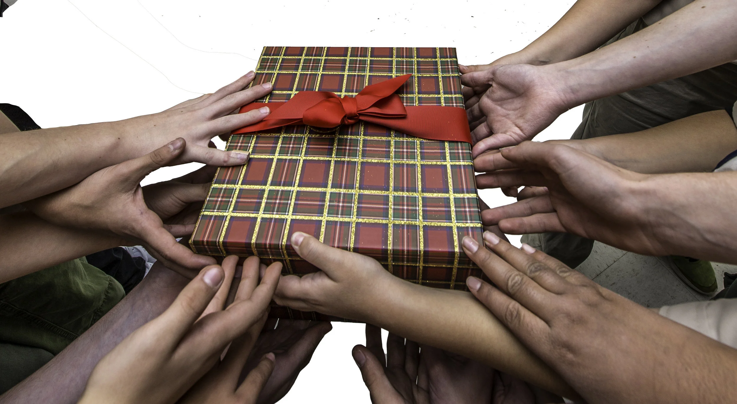
So I took my camera to the Wreath Making Night through the BSA Troop 12 Framingham that I volunteer at. [original image of scouts holding box] But I quickly realized that the box was the wrong size, and the camera angle would need to change.
I then when hunting for the perfect, square box. 6 stores later I found it at Home Goods. I went to the following scout meeting and reshot the scouts holding the box in a camera angle that I could Photoshop in Santa receiving it.
Setting Up the Second Short
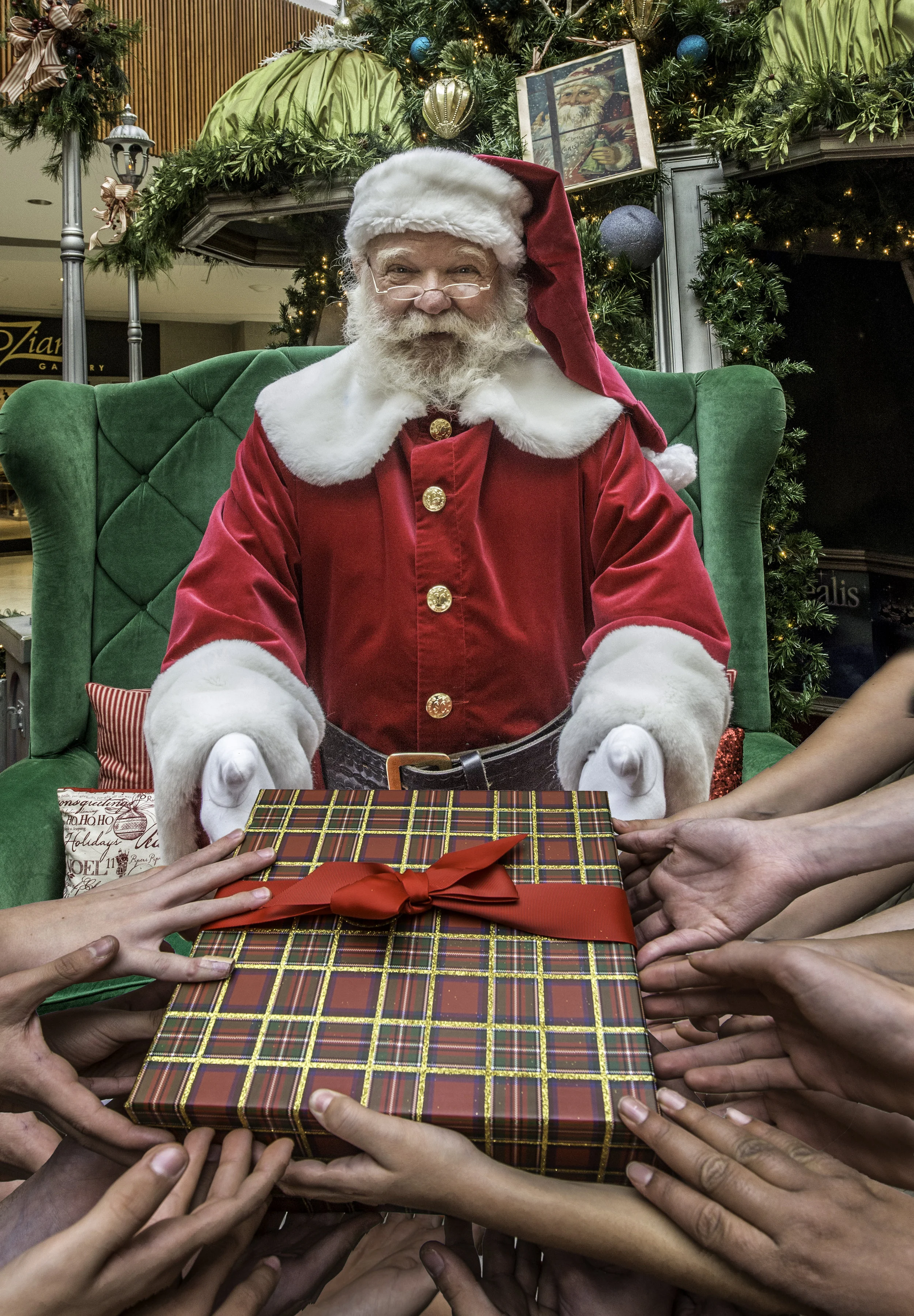
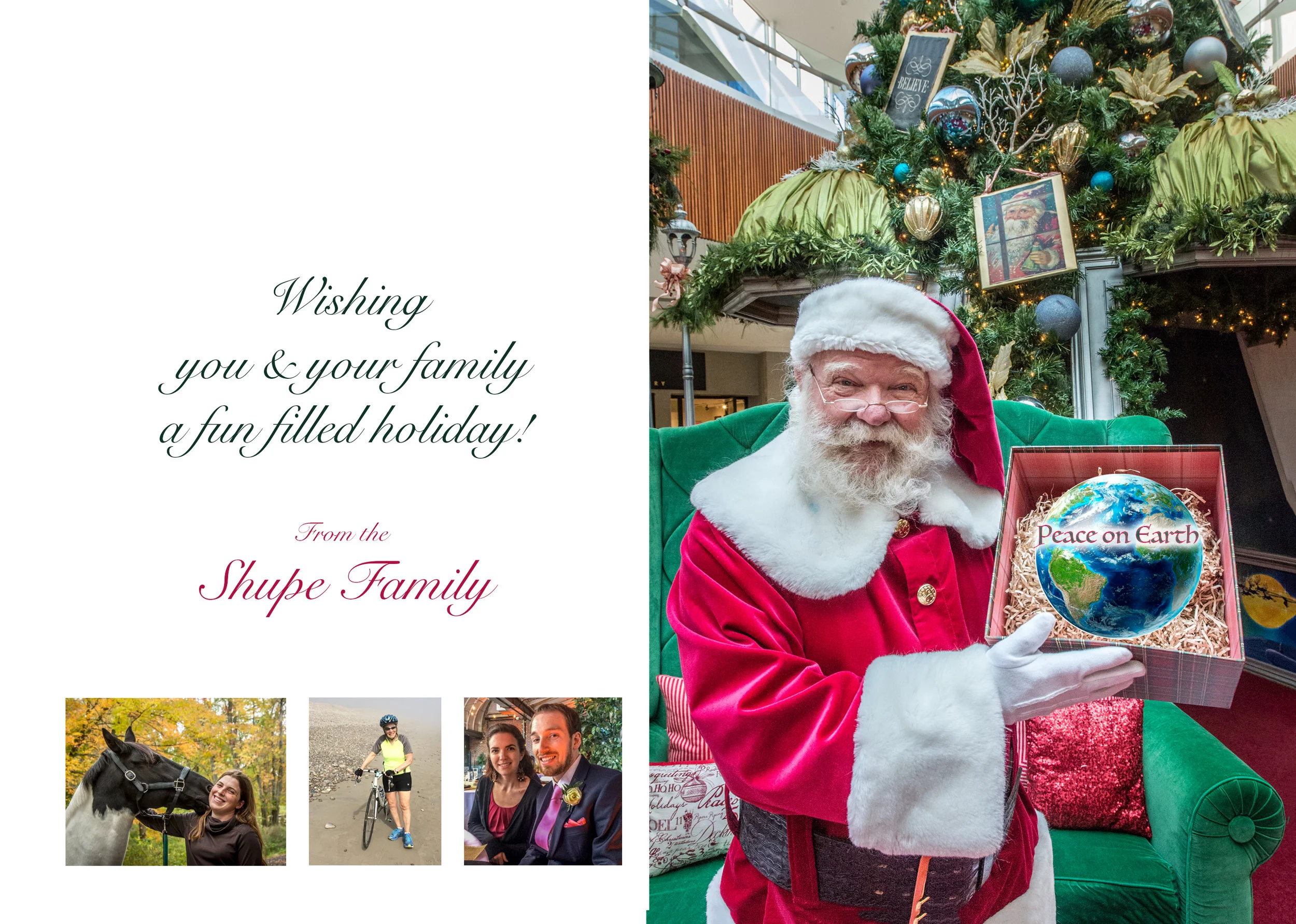
Next, I need a Santa to receive the box. I learned at a local mall had Santa seatings. Having shot Santa before, I knew I should show up just before his shift starts. He was gracious enough to help me out. I had my box and equipment ready to go, so his time was limited to about 5 minutes. I had him pose twice. Once as if he was about to receive the gift and again with it open showing what he got.
Merging Photos in Photoshop
Now I needed to merge them together. I actually made several layers of the kids holding the box so I could silhouette out the floor and see between their arms to a layer of other arms below, skewing the lower layers and adding depth. I also removed the one hand coming in from the upper left that looked out of place.
Then, I added Santa. Cleaned up any issues that made it look not like it was all shot at once.
The inner image of Santa showing off his fine gift. I went again to search engine image databases and found a royalty-free image of the earth to drop into the box. Adding the text on top.
Putting the Card Together
Now to pull the card together. I used again this year PS Print. They provide some great templates to use. After finding a template I liked:
I learned that my artwork was way too vertical to fit so with the dimensions of Photoshop’s Content-Aware Fill, I was able to shrink the image to fit within the template.
So now I had two of the 4 card surfaces files. Next, I added the text: Wishing you and your family a happy holiday. The Shupe Family picking a type style and size that would work best. It has also been a long-time tradition to incorporate images of my family into the card. In this case, since my kids now live on both coasts, I went through my library and picked appropriate images.
Last, I like to add a fun image to the back cover. As well as the all-important © information.
I’ll be putting out about 475 cards to share with my fine clients, friends and family members locally and around the world.
I closing, I hope you enjoyed the card and the tutorial. Peace


