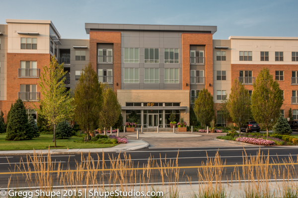
The Visual Eye of a professional photographer works to provide you the client with tools to promote and sell your project. For instance:
On resent apartment shoot I was tasked in one instance to capture the over all room while visually enticing the prospective tenant to want to see more or feel at home.
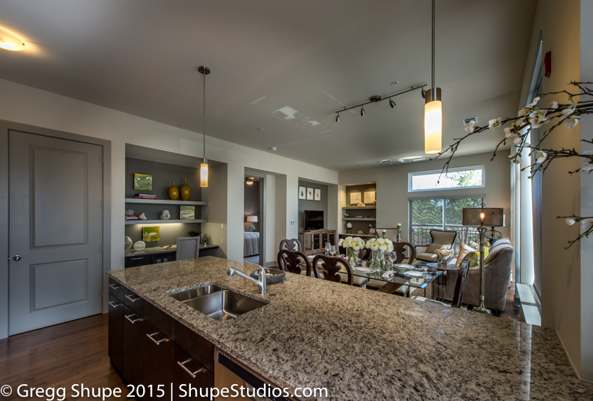
Here is where I started:
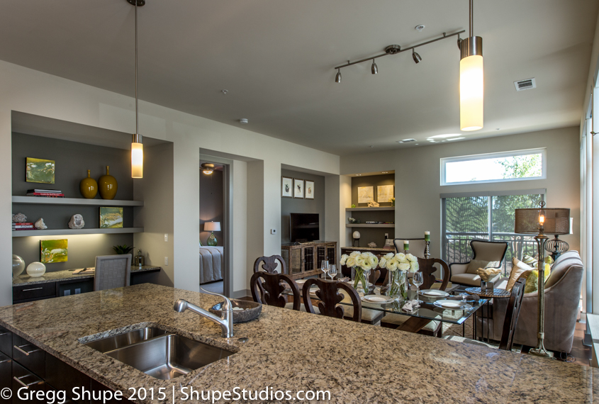
I want to see if I could add more interest. So here is the second shot:
In this image the view is now enticed into the spaces. They first go to the sink, then to dining room table and flowers but are quickly draw into the bed room. Wanting to know more about that room. They then come back and view the reading/office nook. The image give the view lots of information while teasing them to want to see more.
Here is an alternative look:
With this crop the pussy willows framing the left edge adds a sense homeyness plus this crop makes the room look very spacious.
Here is another example of how a “Visual Eye” can overcome obstacles.
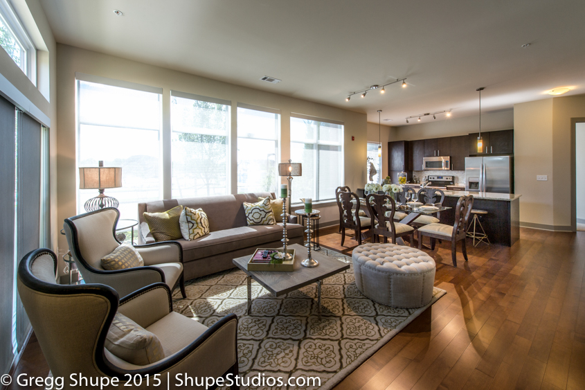
These new apartments are being built across the street from another project under construction. Which you can see the ugliness through the windows in the first image (or image on the left). In the second image (or image on the right), by washing out the windows, the viewer is not distracted by what is outside. Plus this give the viewer a warm sun drenched feel to the apartment. Below is a second example of this process.
Here are examples of shooting the same space but telling different stories.
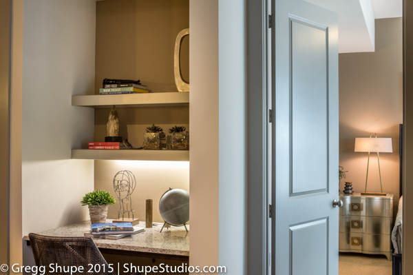
The first image (or image on left) informs of the reading nook on the left and that there is room to explore to the right. While the second image (or image on the right) make it personal. The view can see themselves working in the reading nook, plus that the bed room is only a few steps away bathed with warm light.
Another food for thought. I like to provide the client with different options of light which can produce different emotions from the viewer.
The first image (or image on left) showcases the exterior front with warmth. The grasses in foreground add a natural setting feeling. The second image (or image on the right) has a more sophisticated feel to it. Providing both images, provides the client options in their marketing to tell different stories depending upon what market they are aiming at.
Last here is a good image that could be used as a cover shot of brochure or magazine. Leaving lost of space for text or other images to be overlaid on it.
I hope these images and ideas help stimulate your creativity. Thank you for reading.


